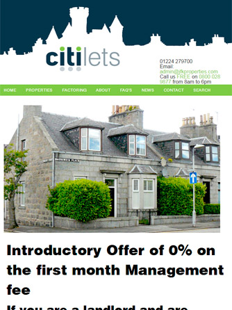
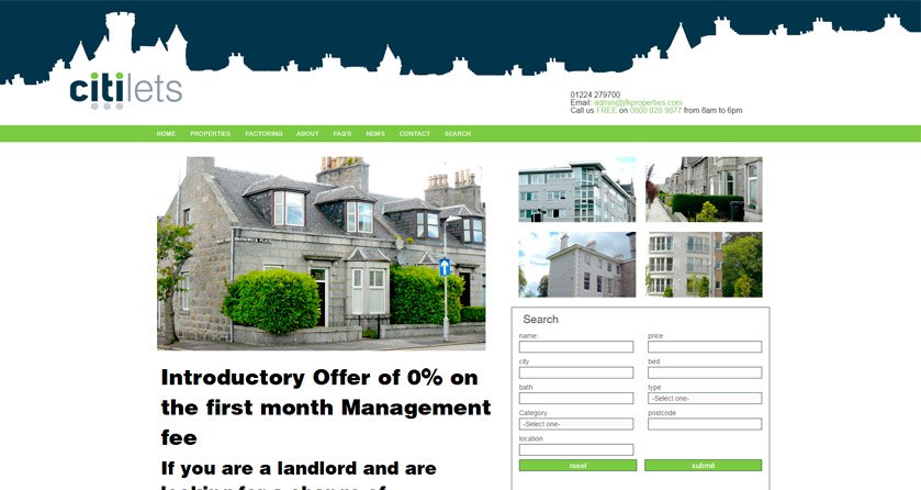
Citilets are an offshoot of an existing company. The directors wanted a stronger presence in this particular market sector. The brand requirements were quite simple - to be friendly, identifiable in their sector and to be a strong stand-alone logo.
Blue-grey chosen to represent the physicality of the city - streets, buildings, roof etc, and the colour suggests solidity, conservatism, strength and support.
Bright green for the verdancy of the North East & eco values, all lower case for friendliness and approachability.
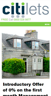
The logo was extrapolated to paper sets and website (including SEO).